Wednesday, January 30, 2013

Personal Style

I intitially was trying to capture steam in this photo. I then noticed the brilliant colors if the flame and the candle. What specifically intrested me was the circle of warmth on the wall behind the candle. I tried to bring that out by using photoshop.

In this photo I focused on the colors and their warmth. I like how the dirt and wearing away of the paint is so clear and crisp.

I love how the red in this photo is so bringht and alive. When I fisrt took it, the flash reflected perfectly off of the candle wax and contributed to its supernatural look.

The light on this flower is very appealling to the eye. Alot is going on in the picture, but the eye is drawn to the flower, its color and the fact that it is in the foreground and very clear.

The design, color and state of being of this object compelled me to take a picture of it. I like the warmth of the composicion as well as the contrast in colors. For example the shadow of the stool below or the purple in the upper left hand corner.

I can't believe that I was able to capture the steam and the liquid falling from the pie!!! Everything in the foreground is so clear and the background is nice and misty. The steam adds some interesting lines and the light in this photo is very comforting. I think that this photo is the definition of the ideal apple pie, the portrait of a home, and the "American dream."


 My absolute favorite is black and white. In all of my photos I experimented with brightness and contrast. I choose this picture because of the light falling on the hand.

I had fun with this picture. I love all of the textures and the contrast. I like alot of contrast, but I also like the picture to look realistic and not photoshoped. It is always hard to find a happy medium because sometimes the two characteristics are not mutually exclusive.
 
I love the light reflection in this picture. The contrast and the various shades of black to white are fun.The perspective is also strange and confusing.


I really like the black and white in this photo. The glass adds an interesting depth and layer. I upped the contrast and made the photo darker.

This chandeler is intrestingly sideways. From the angle that I took it from, it looked like it was swinging. I made the lights appear bringhter, but I wish that I could make them even brighter and more reflective.
 
This last one doesn't look purely black and white, there are so many shades. I like the variety of textures and the differences between the the lights and darks.

Thursday, January 17, 2013

Annotation

I added this quote by William Purkey because I thought that it was funny with the combination of the street, the cow, and the trash.

I played around with this photo and melted the two sandwiches. I also associated them with someone who enjoys food. Therefore I wrote A Melting Foodie. 
 
This photo was bland, but the light resembled some sort of warm flame, candle or light. I wrote fire and repeated it to add more color to the picture.

I like this quote because, it is true. Life does go on. The leaves in the picture will crumple up, dry out, and then die. But in the picture, they are burning like a flame that inevitably will die out.

On this photo I wrote Be An Intellectual because of the placement of the kitten. The kitten is also so playful, while studious which I think is part of being an intellectual. Normally people don't think of being and intellectual and also being fun and playful but it is possible.

I did word association with this photo. When I think of "caution," I think of "may be hot." I also made the word light blue, which is the opposite of something hot that would be red or orange (unless it is really hot, then a flame will be blue).

On this photo I wrote mindless. I just thought that someone could stare at the picture and be thoughtless, which could also be mindless.
 
I had alot of fun editting this photo. I added the word "republic" to it.

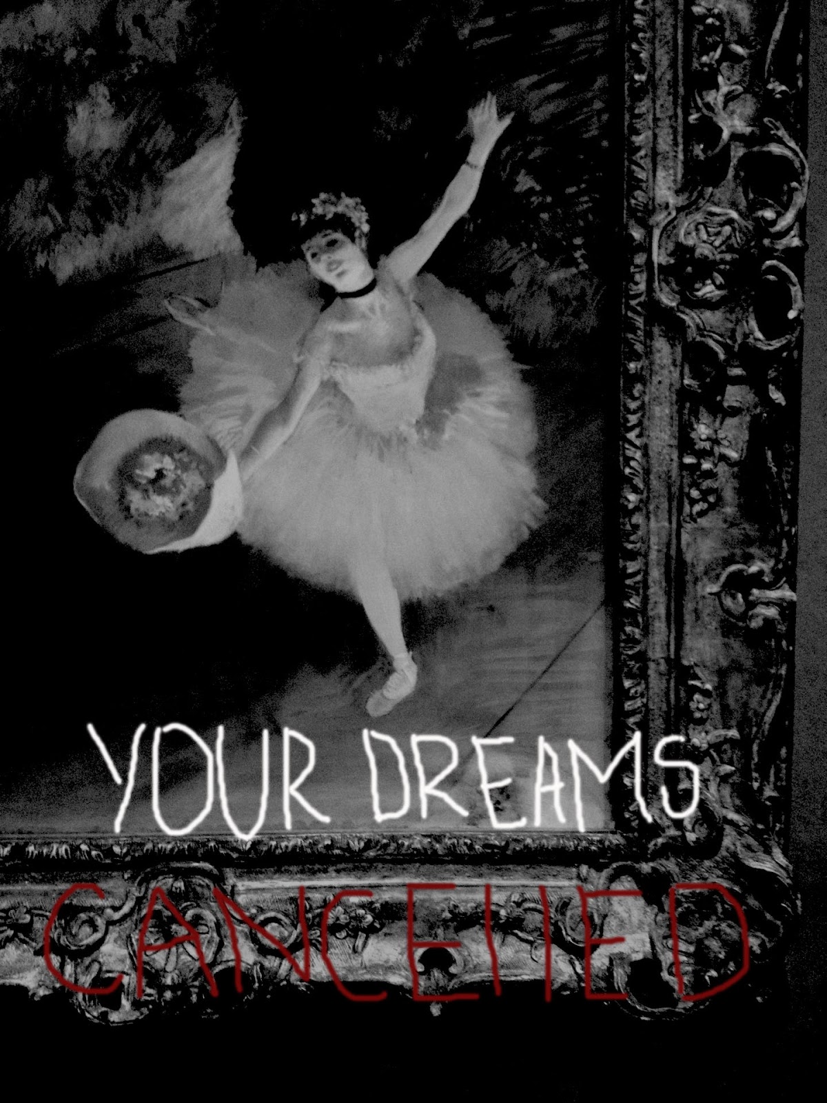
I was inspired by Banksy for this photo. For some reason I find it very relatable and sad that your dreams can be cancelled.

I spent about four classes and around four hours on this photo. I added emotions to the black abstract figure. I think that the words add to the texture of the brush strokes. I meant to also show that an anonymous figure, "a bad guy," a gunman can have emotions. He or she can be complex. They are not just bad.

Thursday, December 6, 2012

Emulating the Style of JR

 
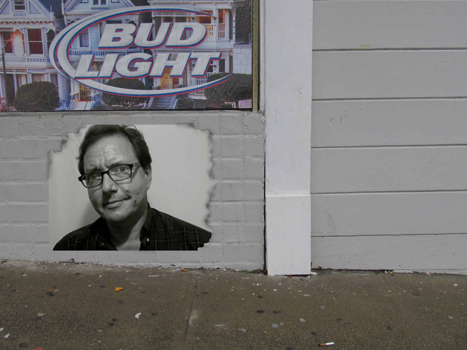
This is like JR's style because of the positioning of the portrait next to a part of everyday life: a corner store. I burned the edges and I think that the burns coincide with the duraflame box in the corner. I think I overdid the burned edges, but overall the composision was successful

I like this picture because it looks slightly more realistic. The dirty sidewalk and the cigarette on the ground are interesting to me. I didn't even notice it on the ground whent I took the picture. Burning the edges definetly was an interesting tool for me.

I like the colors a lot in this picture. It doesn't remind me too much of JR, because of the size of the portrait. Also JR's sidewalk galleries and portraits tend to be taken in more interesting and busy enviornments.

I think that this composision was the most successful out of all six. Although the portrait is small compared to JR's, the background makes it more realistic and more interesting. I like the photo much better in black and white with high contrast (but then again I like everything better in black and white).

Here it is black and white. As a photo I really think that it is pleasing, but Jr's photos of his installations are never in black and white.

 
This photo could definetly be an installation, but the background was not succesful. JR would not have posted one of his portraits on this wall. I think that this would be a good religious portrait, but it would be more successful placed somewhere else.


 This last one I just had fun with. I edited the backgroung and worked on it loosely. I think that it could be bigger and look more realistic.

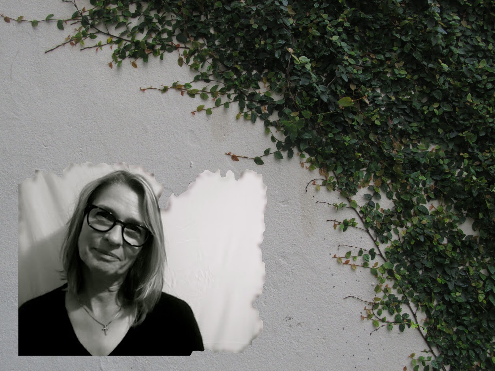
This is just a backgound that I photgraphed for this project. I think that it is very interesting, but it is not busy enough and it is not really JR's style.

I like this background, but I think that it would look bettwe if there were some boxes or trash in the picture. I think that a sad portrait would be perfect for this background because of the water droplets on the hand rail.

Tuesday, October 23, 2012

Macros

This photo was taken with a painting as the background that I have in my house. The orange cone is a tiny, plastic object that is nowhere near life size. This photo was really hard to take because i had to hold the cone with one hand and take the picture with the other. It was also hard to make the background realistic because the flash would show the canvas that the painting was on.

I really like the light and colors in this photo. I still can't figure out if the lion is in pain, is angry or simply ferocious. Finally I really like the texture and shadows that the crumpled paper adds to this picture.
 
From 1994 to 2010, the U.S Military's "Don't Ask Don't Tell" policy discharged over 10,000 personelle for being open about their gay, lesbian or bisexual status.

I spent alot of time thinking about this picture and what I wanted to show. First of all, I wanted to tell a story and send a message out. In the photo the soldiers are turning on one of their fellow combatants who is gay. The one soldier in focus is not participating, and yet he is not doing anything to stop the abuse, the discrimination. What I wanted to emphasize is the importance for standing up for what you believe in is right. If you are not participating, it probably means that you don't think that was is happening is right. Break away from the group and the pack mentality. Stop discrimination and actively stand up for others.

For this photo I spent time painting the soldiers, cutting out the background and the floor. I used three different images of cement to create a more realistic picture and compostition.

The light in this picture is really interesting. I spent alot of time working on the lighting and the shades of colors in this picture. To me, the photo conveys true vulnerability and shows a woman being exposed.

Women working 41 to 44 hours per week earn 84.6% of what men working similar hours earn; women working more than 60 hours per week earn only 78.3% of what men in the same time category earn.
 
This photo was created to potray women being exploited in the media and solely focused on for their body and apperance when really the media and everyone else should be focusing on life, and what is really going on in the world.
 
In this photo the subject (plastic doll!!!) is partially in focus. I think it is funny and maybe a little ironic because the subject is adjusting the zoom and perhaps clearity in the photo that he is taking. I really like how the background is blurry and filled with light. I think that this photo is full of different styles and levels of focus.

Monday, October 15, 2012

Eight Portraits Emulating the Style of Richard Avedon

This picture is so clearly black and white. The cross and the glasses add so much personality to the subject, while the look in her eyes conveys a sadness masked by her entire demeanor.

This picture is black and white, but after some editing I added more contrast and fading, and it began to look more brownish. The look in the subject's eyes is one of ambition and boyish delight. I also like that the fabric is folded in such a way that it gives the illusion of sun being cast down on the subject.

In this picture, the subject looks confident and at ease. I am grateful that I was able to catch this moment.

The connection with the camera that the subject has in this photo is awesome! She looks so comfortable, relaxed, and pretty.

 I love how I was able to catch this moment of sadness and acceptance. I think that the eyes convey something real and the mouth does too.

This picture is very unique. I love to play with texture, so I choose a bumpy white background for this photo. It is less traditional. The subject's eyes are really intriguing although they are not looking at the camera.

This picture is so real to me. The subjects eye's are so soft, while the picture is hard and contrasting. The picture is a contradiction. There is a loving smile on the subject's face, while he is also stern.

I love the contrast in this photo. The subject looks so elegant, powerful and yet sad too. I think that it truly emulates Richard Avedon's style through its beauty and true emotion. 


Monday, October 1, 2012

Light Painting

I like this photo because the light illuminates the hand. It is an empowering image. I think that it eminates strength.

This is a cool picture because it is filled with such warmth. The iluminated wood and orange color adds to the warmth. I also think that the light painting looks like a dragon or some mythical creature.

Thursday, September 27, 2012

Motion

This photo was originally bright yellow and black. I moved the camera slightly to blur the picture and create a sense of motion. I also edited it to make the yellow more murky and greenish.


This photo is of another picture hanging inside our school. The glass and flash caused white to appear in the photo along with the bluryness. I like this picture because it gives off a majestic and hevenly vibe.

In this photo the blur gives the illusion of motion. I think that it is cool how the contrast between the book and the symbol blend into each other.

This picture is my favorite. It was originally in color but became more appealing to the eye when I made it black and white. I think that this is such an iconic picture and that the bluryness and color give it a new perspective.